Case study: A shiny, new brand design for Women Mean Biz
Written by Rose-Innes Designs on 6th December, 2012

Women Mean Biz is the culmination of years of experience and research, resulting in a focused, empowered and purposeful business forum exclusively for professional and entrepreneurial women. Founded and run by Philippa Constable, she came to us to help take her business network to the next level with a new brand design and website to enable her to be a step up from her competitors.
The previous incarnation followed the style that most of the industry focused towards women based themselves on – pinks and greys with lots of white space. We selected a small range colour palettes that would complement each other, using a stronger primary colour for the main part of the brandmark and a secondary, softer colour to back it up. Once Philippa had settled on a teal and lime palette, we worked it across the range.
The new brand identity system was based on connection, with a series of shapes that interlocked and wove together into a bright, fresh, logo and that retained a feminine element to it. The weaved pattern was used as a basis for brand recognition and carried across the range of literature to create a friendly element to the type of material that goes into creating welcoming impressions to potential members.
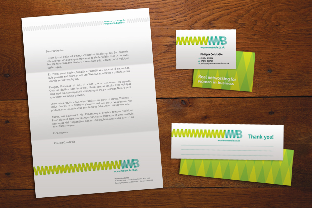
Brand literature; letterhead design, business card design and referral bookmark
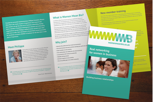
Introduction booklet front cover design and full spread layout design from the Welcome Pack
Philippa already had some nifty ideas in place, such as a Welcome Pack that included referral cards that doubled up as bookmarks and a foil blocked folder and notebook, which we helped to refine and bring together in an open and modern way. We took the brand colours across the whole range of company literature and exhibition material, ensuring a recognisable and friendly tone across the range, which then followed through to the design of the website.
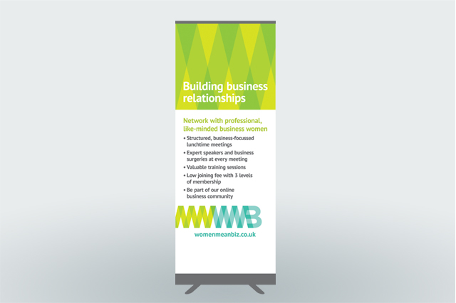
Pull up banner design for events and exhibitions
The website was a user-focused web design project that was mindful of the growth of the business that Philippa is expecting as she rolls out the business into a franchisable business package.
The site has been designed to allow for community functionality – prompting members to connect, interact and recommend other businesses.
Once a user has joined up they have access to create a personal profile page that showcases their area of business and a section that allows for more personal questions to bring in a friendly, social aspect to their business networking.
We introduced a new colour to the palette for the web, the bright coral, designed to draw the eye to important areas where users are required to take action.
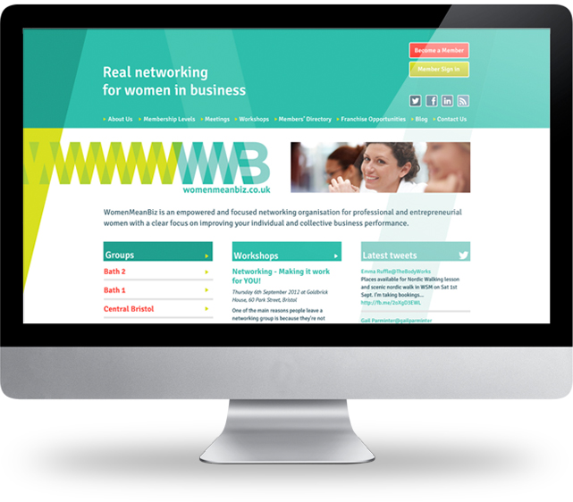
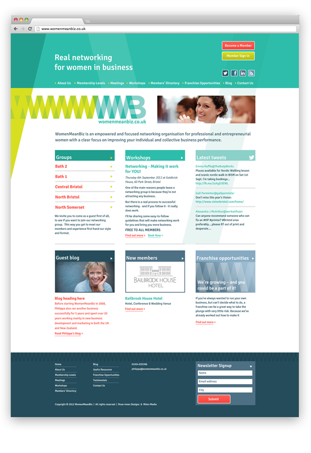
The new brand has been really well received by the Women Mean Biz networkers! We know it will play a big part in launching Philippa into the next stage of her exciting business.
If you're looking for a bespoke brand design to help your business get noticed, you can call us on 029 2120 2250 for a chat.