The return of the Rose-Innes Creative Breakfast™
Written by Rose-Innes Designs on 14th November, 2013
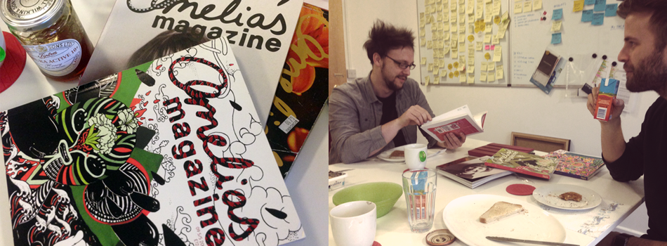
We kicked off our new season of creative 'bring 'n’ share' breakfasts today. An idea we started last year as a way of looking out at what we like in the creative industries, we gather early for breakfast before the day of work in the studio.
Toast, jam, marmalade, bananas, Weetabix, coffee, tea and juice – but that’s not the creative part!
Gareth brought in an awesome screen print by Hydro74, one of many design pieces from this amazing artist and we are now all converted followers. The detail on the Smashing Pumpkins limited print is to die for – black/gold/silver on rough paper looks stunning. We then marvelled for a while at the 'chameleon' beauty we see with the ITV brand logo; how the colour doesn't matter but the shape does and how we've grown to love it more since its rollout almost a year ago.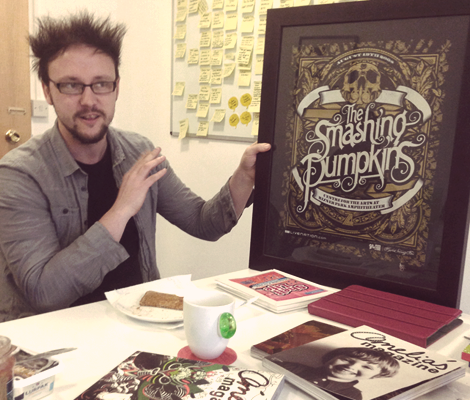
This led nicely onto Valentino's contribution that looked at the rebrand of the Whitney Museum of American Art that made the rounds in design circles earlier this year. Very inspiring to see a logo pushes the boundaries of traditional brand rules, the W can be fluid enough to adapt to many applications and it really looks fab on the stationery and bags and so its become like a brand mark that can be easily used on anything – in almost any way! We love brands that break the mould.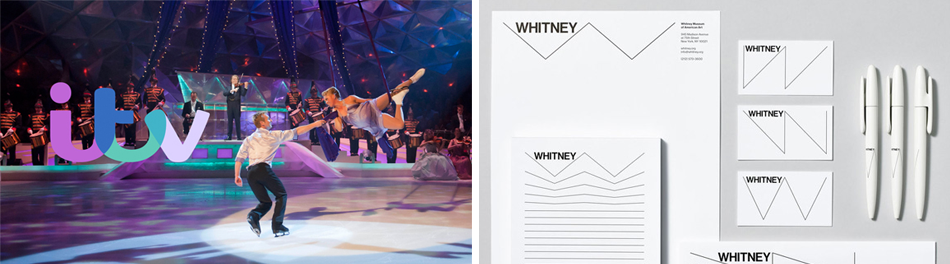
This led nicely onto Valentino's contribution that looked at the rebrand of the Whitney Museum of American Art that made the rounds in design circles earlier this year. Very inspiring to see a logo pushes the boundaries of traditional brand rules, the W can be fluid enough to adapt to many applications and it really looks fab on the stationery and bags and so its become like a brand mark that can be easily used on anything – in almost any way! We love brands that break the mould.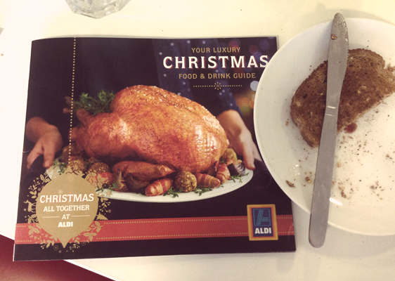
My offering was the Aldi Christmas food promo brochure, behold a masterpiece of photography, type and layouts that could just as easily compete with the likes of M&S for marketing style. The quality and detail noted in the brochure, reflects well on their products, though it's let down in store with delivery of service. We went on to talk about how Aldi as a brand has crept up in the realm of supermarket giants, and we thought it was likely based on the quality of products. Customer service and store experience was certainly a no nonsense, no glam, hypermarket style with room for improvement.
So that was this morning, and all before 9am. We are always looking for things of interest to review at our fortnightly breakfast club, feel free to contribute via Twitter or come and join in if you're based nearby. We put on a great spread!