Arts & Education Network
The Arts & Education Network: South East Wales is part of a major new Welsh Government/Arts Council of Wales project. The project is a new five year arts and education action plan on which the network will work with schools, the Regional Education Consortia, local authorities and stakeholders in the education, arts, creative, cultural and heritage sectors to improve arts experiences and opportunities in schools.
BRAND IDENTITY PROJECT
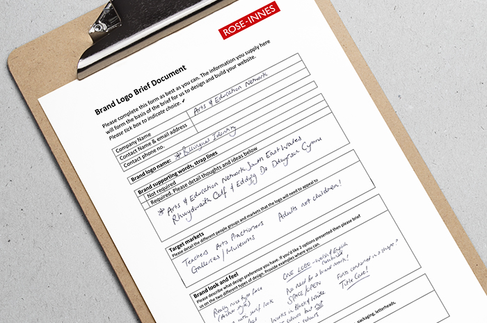
Four regional networks are at the heart of the Creative Learning Programme and the South East Wales region approached us for their individual brand identity. With teachers, arts practitioners, gallery and museum staff, arts and education organisations being the target audience, the brand look and feel needed to be focused towards professional adults not children.
Beginning with an initial alignment meeting, based at the historical building of Blackwood Miners Institute we were able to complete our brand questionnaire. With all brand design preferences defined we were able to combine the values, vision and culture of Arts & Education Network into an identifiable brand.
DESIGN CONCEPTS
Fully prepared for the task ahead, we developed three bilingual brand identity concepts on which we considered the brand across a number of deliverables such as business stationery, social media, pop-up banner and a flyer.
There are many ways in which the Welsh and English language could be combined and whatever format is chosen the most important consideration is that both languages should be equally legible. Where feasible, both languages should also be accessible in a single eye line.
It is important that the two languages are not mixed in an inconsistent or haphazard way. Ensuring that both languages are separated and easily identified is more critical if the following formats are chosen: block by block, parallel columns, or top and bottom.
With a strong idea of how the brand would look, we experimented with different typefaces in different layouts to provide an elegant, professional identity that showcased the flare on which the Arts represents.
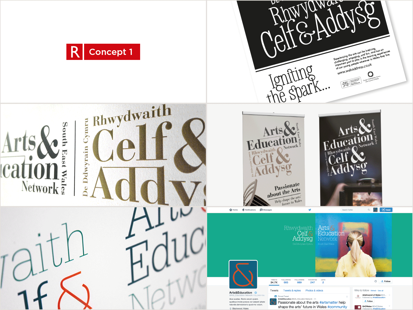
Brand identity concept ideas
DESIGN SELECTION
A clear winner was selected without hesitation at presentation stage – the ligature design!
There is probably no artistic style more appropriate than blending two or more letters into one. Ligatures means to tie and letters that are tied makes a compact signature perfect for the Arts & Education Network. The sense of rhythm and the interest of characters naturally linking portrayed the values of collaboration and togetherness down to a ‘T’.
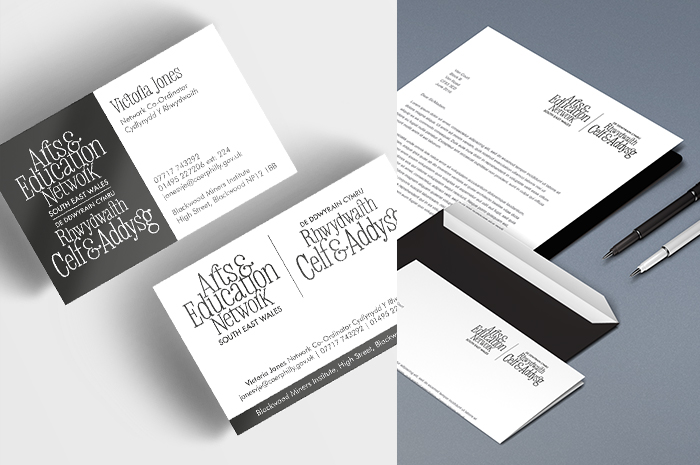
Business card and letterhead
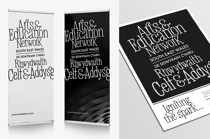
Pop-up banner and flyer
Design Deliverables
With the brand identity successfully fulfilling the brief and working across various platforms, we generated a logo pack with supporting guidelines of how the brand should be used. The brand guidelines essentially summarises what the brand stands for and also provides guidance on how the brand identity elements such as logo, fonts, colour palette and social media graphics should be used and communicated.
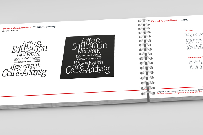
Brand guidelines
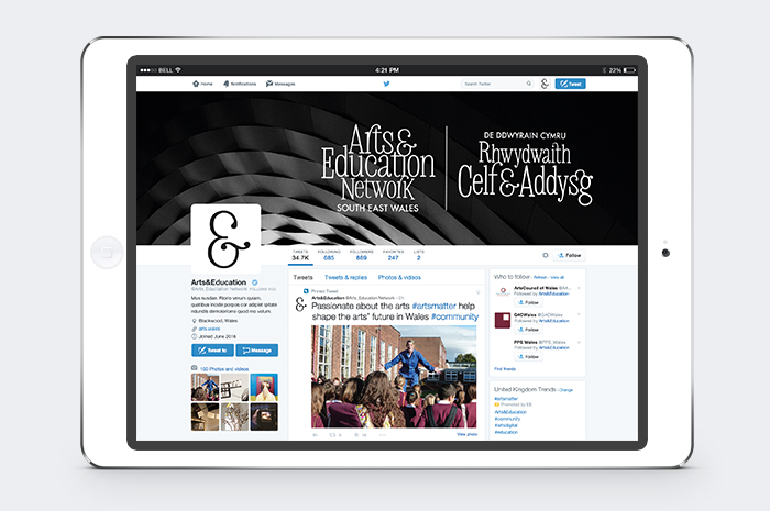
Social media graphics


