Thirst Pockets
Did you know that there is an art to selling kitchen towel in the supermarket? There is an abundance of choice for you as a consumer and each manufacturer is trying to appeal to something in your nature that will make you choose them. Intertissue acquired the Thirstpockets brand and wanted to increase the stakes by making some updates to the brand. There's one way to make a difference to the competition and that's by using design as a differentiator!
The story of the design
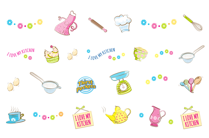
With the development of intertissue printing techniques they can print virtually any combination of colour and pattern. Our brief was two fold. One was to create a set of designs that would showcase their print capabilities. The other was to appeal to the person that loves their kitchen, thus the term "I love my kitchen" has become a feature of this style. We wanted a quirky vintage theme to create a stir on the shelf, so we gave it a slight edge; biscuit tins, weighing scales, aprons (straight from the post-war era!), egg holders and cup cakes. Our designers sketched and coloured variations to create six different icon sets to appear on rolls. The initial concept presentation included a host of other sketches of things like breads and coffee cups, though we soon got it narrowed down to the best selection. Kitchen roll is typically printed on one large long kitchen towel and then chopped down to the size we buy off the shelf. So whether its one design or six, that doesn't make a difference to the print! When designers aren't constrained to print specifications they can get a bit excited.
Making Kitchen Towel stand out on the shelf
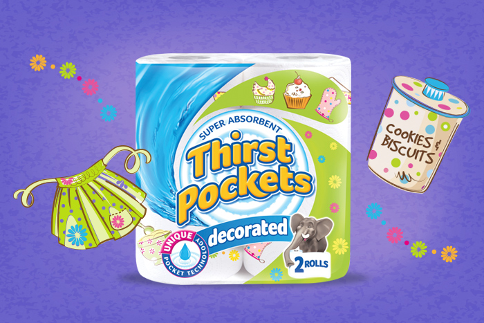
Packaging film design is the first visual touchpoint on shelf. The brand is king, then the decoration and pack design theme supports it to create in this case an informal friendly colourful pack. We haven't amended the brand with its well known Elephant, though Mr Elephant may well be making a disappearance over the next strategic brand developments! Shhh! Adding the kitchen icons to the existing theme packs and using a green swish as well as the blue to brighten it up and make it stand apart from some other well known brands in the aisle. Designing wisely the patterns need to work on coloured backgrounds as well as the white base kitchen towel.
Marketing materials
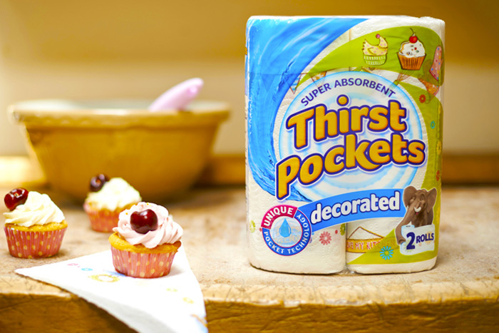
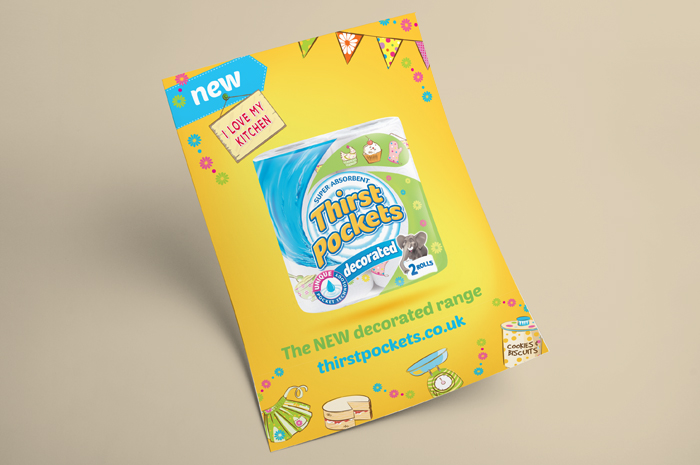
We organised a creative selection of photos for their advertising and tradeshows. Bright colours for impact and use of the icons scattered over the page worked well for trade magazines.
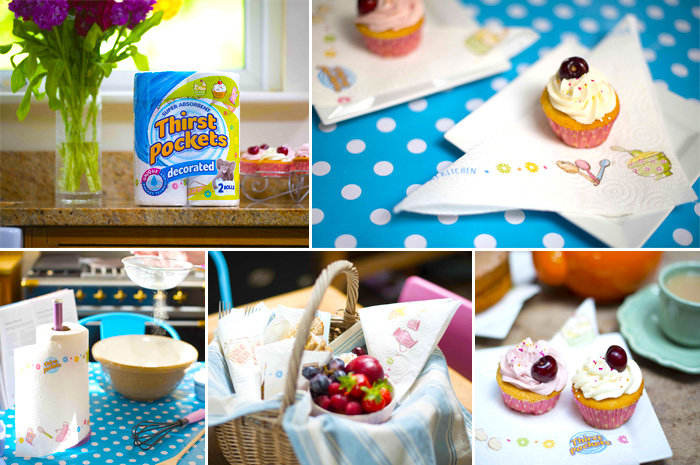
Below are a selection of images from our photoshoot. The cupcakes didn't last long that day!
Thirstpockets website
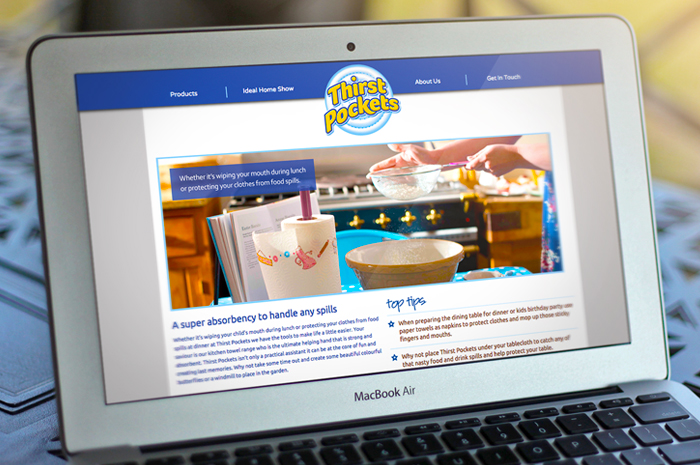
We had designed this website almost a year prior to the release of the new decorated pack. This site will be updated in due course but below is a screen of one of the pages. The website is full of ideas and uses for kitchen towel as well as downloadable pdf games and activities.
End Result:
“We loved the designs and the variety of retro sketches on the kitchen theme and they've been well received throughout the group. Always a pleasure to work with the designers at Rose-Innes, they’ve done a great job on this ”
Beverley Logan
Product Manager (Brand), Intertissue.
