Women Mean Biz
Founded by successful businesswoman, Philippa Constable, Women Mean Biz is the result of years of experience and research into how women can get the best out of business networking. Having been a member of business development schemes and networking organisations herself, Philippa realised women needed more than what was on offer. She’s developed a format that’s proved successful for hundreds of women, whether in business for the first time or with years of experience.
Refreshing a common theme
Philippa approached us with the intent of taking Women Mean Biz in a new direction from its previous incarnation which took a more obvious feminine approach to branding. During the briefing and research stage we found that the majority of Philippa's competitors involved some variation of pink that she wanted Women Mean Biz to come away from while still maintaining an open, friendly and somewhat feminine look and feel.

Main logo

While designing the logo we kept one eye on its application throughout various material. Though we imagined the primary logo to reach as short or long as necessary, a lone version was created should the logo need to be displayed without a cut off point. This allowed for many options in application.
We worked a small number of identity solutions that explored taking the brand in other directions while staying out of the 'anything pink and flowery'. Philippa pointed to the above zig-zag icon which we presented with some options for fluidity within the identity. Taking it further we explored a range of colour options before settling on the aquatic and lime greens.
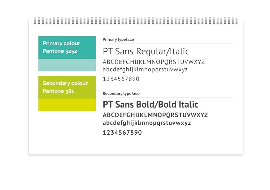
Colour and type options for Women Mean Biz that formed part of the style guide we developed
The flexible brand pattern was brought across a lively range of stationery and literature to be used for WMB communications and formed part of each new member's welcome pack.
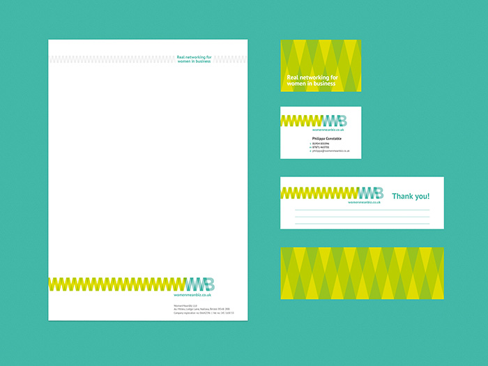
Stationery set for Women Mean Biz included letterhead, business card and a joint referral slip and bookmark
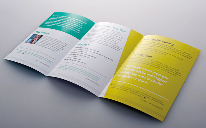
Invitational brochure
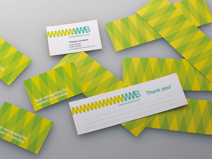
Business cards and bookmarks/referral forms.
We also developed a website that allowed for a directory of members and easy registration for new sign-ups. A site with lots of information was structured into manageable sections and featured a system that was easy to use for everyone, from frequent editors to light users. On the site we introduced a coral red to be used as a more direct call to action colour.
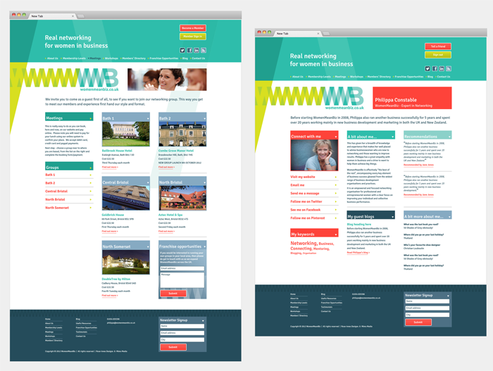
Website and blog
To complement the range of printed literature we also designed some exhibition banners for networking sessions. The look completes a friendly, approachable brand.
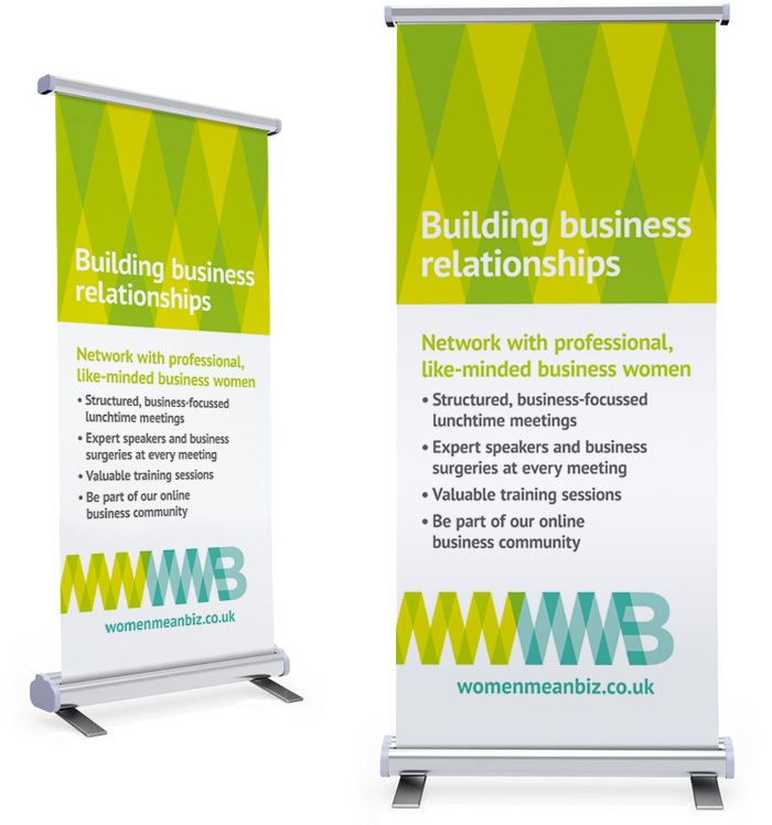
Eye-catching exhibition banners
The outcome
Altogether we hope to have moved this particular female networking group out of the typical stereotyped brand styles while still maintaining a feminine vibe that its members can own within their chapters and use to expand and increase membership.
Since the rebrand the WMB website has seen visitors increase along with increased membership and application for the site rather than just a hub for information.
Chapters continue to open across the south-west of England and South Wales and there has even been setup of an annual conference called Women Mean Biz Live! featured guest speaker Rubyt Wax that we were asked to follow up with a similar identity and materials that we were thrilled to be a part of.

Logo and flyer for the annual WMB Live event
