Leading Growth Concept
Leading Growth is a leadership training enterprise, focusing on supporting managers within small to medium sized companies.
They came to us to rebrand their business and create a complex website to help their users access all course material and connect with other course members. They didn't just want to focus on gaining new members to join courses, but also provide a network for members to interact and communicate. Think of it as a localised ‘linkedin’ for alumni.
STAGE 1 – BRAND VISUALS (DESIGN)
The Leading Growth brand is key to promoting the business further and required an individual look to support this. The brand needed to be sophisticated yet friendly.
ICONMARK
The iconmark is a unique element to help with brand awareness, in this instant, it is bold and vibrant in appearance but also in its basic form symbolises a lot to do with the business itself.
We like to think the best ideas are simple ideas, we stripped back the concept to its most minimal form, looking purely at shape recognition, the word ‘growth’ is represented with an upwards triangle and a ‘network’ is represented by a circle.

This then formed the basis for the icon, which was then enhanced through three interlocking colours (representing members of the course) in a continuous loop, signifying unity and togetherness. The triangle to represent growth was left as a negative space contained within the circle.
![]()
CUSTOMISED LOGOTYPE
To help the logo be more individual, we customised the type based on the 'Volkswagen' font. Adding a feature to the end points of certain characters helps give the logo a bit of life.
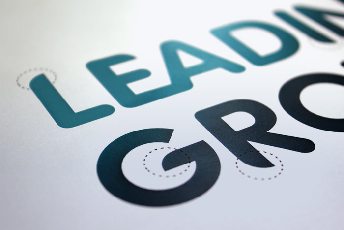
Customised font
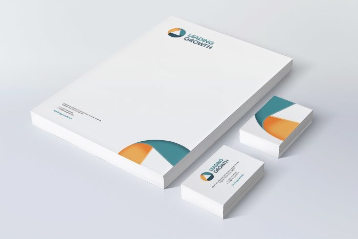
Stationery
STAGE 2 – WEBSITE DESIGN AND DEVELOPMENT
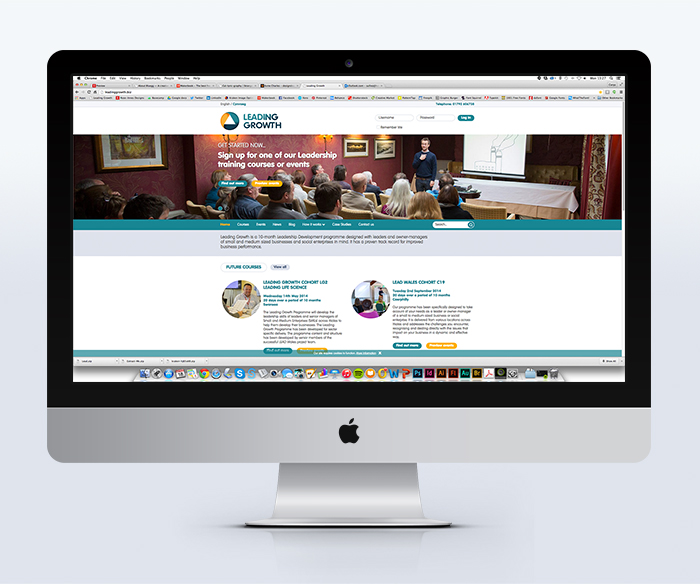
The old site lacked a memorable look and was a user nightmare. The site needed a complete overhaul and a thorough UX design job. Many new features needed to be added to give all new members an easy experience to book on to courses and for current members to be able to login and access resources and the business directory.
UX DESIGN
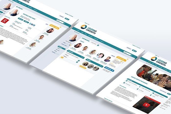
We collaborated with our development team to make sure the user journey was well thought out and very simple for the end user. We spent time sketching out each page and the flow through. This was one of the main drawbacks of the old site, and thus deterred many members from using the system regularly. Through careful planning and execution we came up with the best possible solution to make the site easy to navigate; front end and user logged in state.
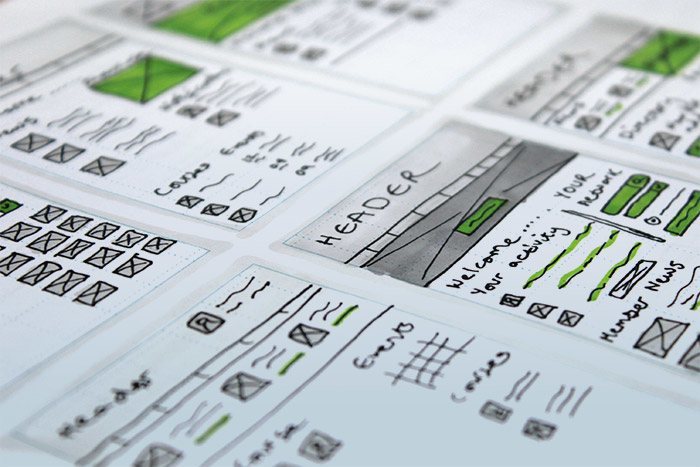
WEBSITE DESIGN
The site is now not only visually more attractive but functionally better and easier for the user to navigate. It retains a friendly, consistent feel from the brand, using elements such as, circular images and rounded buttons. The website was very complex and featured many different bespoke requirements such as a booking and payment system, database directory, profile pages, image galleries, resources and blog.
