NHBC Brand Design, Internal Comms
So, why would an organisation need a different treatment for their "internal" brand than their "external" brand? A large and complex business like NHBC has a very important internal comms function to keep their staff and departments connected and informed. Their marketing department required a 'sensible' and suitably different treatment of brand on internal communication. We took them through a process which delivered a simple and engaging solution, that marked each piece of communication as special and different. The process went like this...
PHASE 1 - WORKSHOP and RESEARCH
Discovering the Client's objectives and getting on the same page is the most important to start us off. We held a day of brand insight workshops for key staff members across marketing, operations and personell held at NHBC, Milton Keynes. We spoke to staff and gathered insights on the brand as well as reviewing all of the existing research, staff surveys and statistics that they had already. It became apparent that the brand was not all together clear and that they needed a set of brand devices and a style guide that would give them consistency, ownership and clarity.
The internal communications had to compliment their current corporate identity, brand style and logo that had only recently been refreshed. We came up with a range of "common sense" solutions to present to them.
PHASE 2 - PRESENTATION OF BRAND CONCEPTS
CONCEPTS
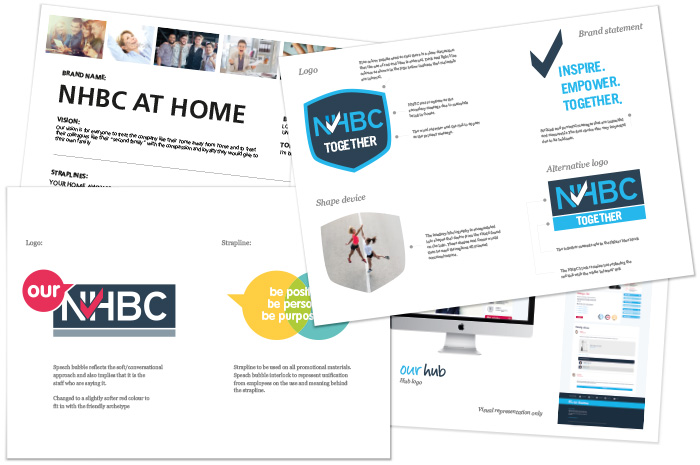
The studio design team absorbed the research gathered in the first phase and then delivered three different design approaches to the NHBC team; each design being a very workable solution that could sit alongside their current corporate brand. During this design phase we identified brand archetypes which we applied to each of the concepts; firstly that of 'Guardian' and secondly a 'Friend'. The designs showcased sets of different words, colours, fonts, illustration styles, design devices and infographics presented on magazine covers, intranet dashboard, posters, how to guides and email banners.
SELECTED BRAND DESIGN
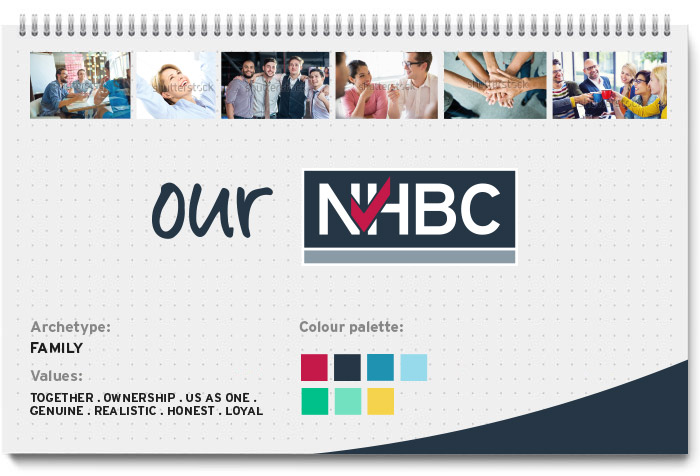
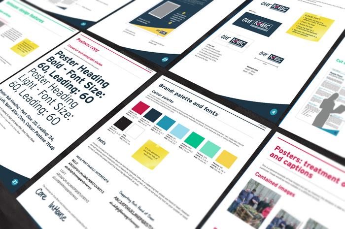
Simple is best! The tonation of words that defined "ownership" and "belonging" proved the best and most workable option. The treatment of words like "ours" "us" along with colour palette and handwritten font.
PHASe 3 - DELIVERABLES
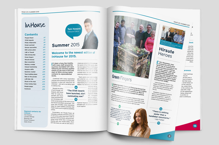
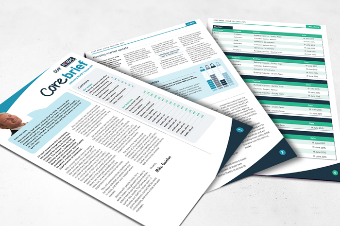
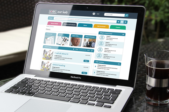
With the brand and identity firmly agreed on, we provided the brand devices and design elements to NHBC, so their in-house marketing and design team could use it across a whole range of channels. We also designed comprehensive brand guidelines as well as a number of Adobe templates for their Core Brief newsletter, InHouse internal magazine and wireframes for their intranet. Not forgetting the internal brand "Best Practice" document, designed to be simple and easy to understand by all members of staff.

PHASE 4 - FEEDBACK
"Michelle and the team came up with a creative solution that made complete sense to us in the marketing dept. They considered the hierarchy and brand applications sensitively and the process was good, it involved our staff to contribute their thoughts and ideas. The process was interesting and inclusive and so the outcomes were much better defined. We are currently running with it and receiving some good feedback"
Melanie Thompson, Production Manager.
"Many thanks again for making our Hub happy!"
Juliet Darvill, Web and Intranet Manager
